Start with a colour you love
Rules assigning certain colours to grey dogs and different ones to fawn dogs can be limiting. Start with a shade you enjoy seeing every day. Then look at it in daylight; screens and warm lamps change the impression. Our sample catalogue uses generated imagery, so physical fabric swatches would need to be checked before production.
Contrast or neighbouring tones
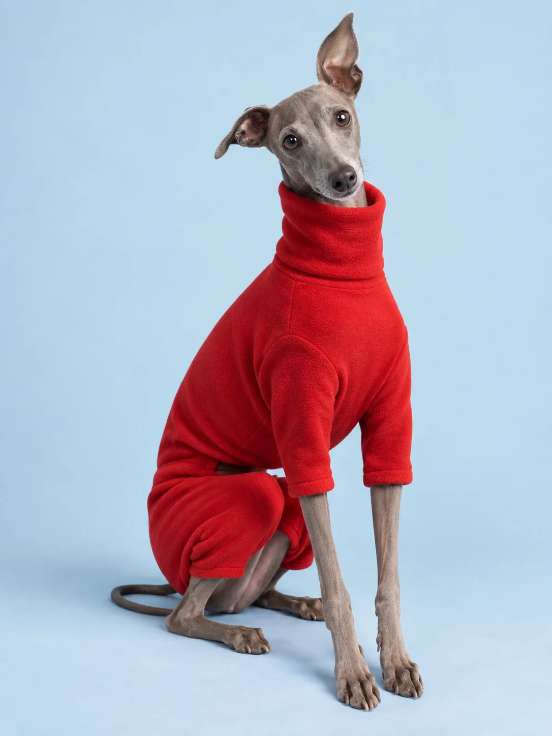
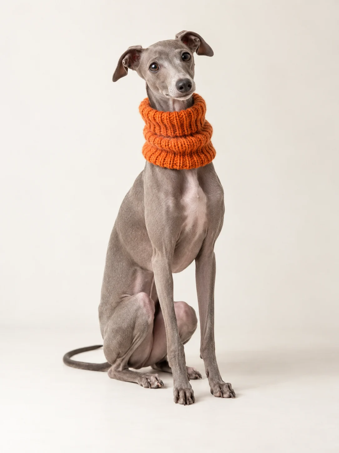
Tomato fleece creates a clear contrast against grey fur, while an oat vest on a fawn dog feels softer. Both approaches work: one makes the garment the focal point, the other emphasises shape and texture. If you are unsure, begin with a neutral piece and add a small bright detail.
Let stripes connect the palette
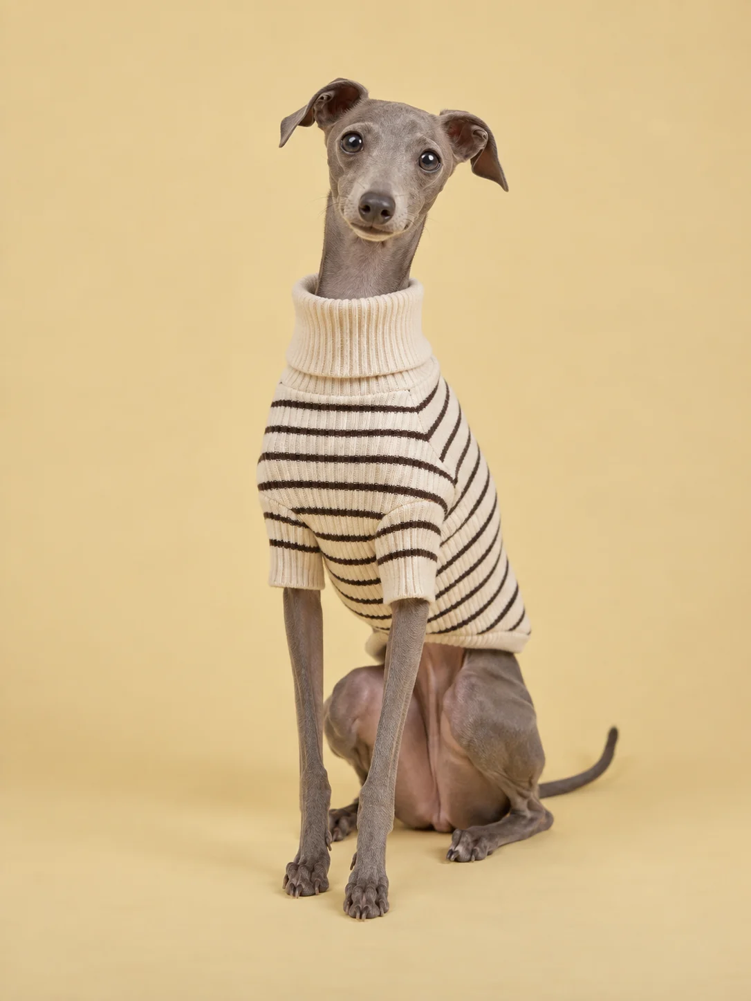
A striped sweater already brings two colours together, making a plain accessory easy to add. Exact matches are optional. Chocolate stripes can relate to a caramel leash, while a cream base connects with a person’s lighter outfit. Keep one dominant pattern if you want the combination to feel calm and coherent.
Consider the whole picture
Outside, the garment appears alongside walking equipment, your shoes and the surroundings. There is no need for a complicated colour exercise; two or three repeating shades are enough. Keep practicality in the picture. A favourite colour works best on something easy to put on, wear and care for.
Useful? Save it for your next walk.